

Interior Design Neutrals: A Complete Guide for Florida Homes


Most advice about interior design neutrals starts with a false promise, that neutral rooms are the easy choice. In a Florida home, especially in Longwood, Orlando, or Winter Park, neutral design is usually the harder discipline because the colors have to behave in bright sun, under evening lamps, and beside real materials like solid wood, leather, and woven fabric. The good news is that the right neutral palette can make a home feel calm, finished, and expensive without slipping into a flat beige blur.
Why Neutral Design Is More Technical Than You Think
Neutral design looks simple from a distance, but it rewards precision. A room can feel elegant in one light and oddly dull in another because the color choice, the finish, and the material all interact at once.
A neutral is never just “plain”
A strong neutral room depends on light reflectance, undertone, and surface texture, not on the absence of color. Design guidance from Sherwin-Williams notes that a practical working range for an airy neutral often sits around 50 to 60 LRV, while higher-LRV neutrals above about 70 reflect more light and create a stronger sense of openness, especially in smaller rooms (Sherwin-Williams neutral paint colors).
That matters in Central Florida homes where sunlight can be intense and ceilings can feel low or visually busy. A pale wall beside a dark sofa, for example, doesn't just change mood, it changes perceived scale.
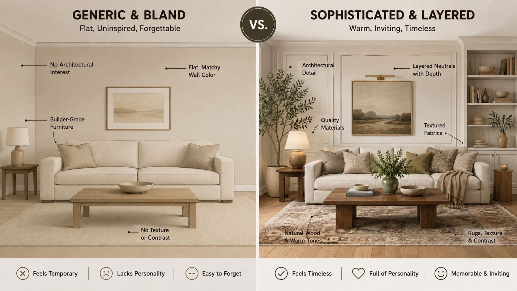
Practical rule: neutral design works best when the room has a clear hierarchy, one base tone, one supporting tone, and one material that adds depth.
Why designers spend so long on neutrals
Neutrals aren't chosen to avoid commitment. They're chosen because they have to coordinate with flooring, upholstery, trim, and the way daylight lands across the room. That's why a neutral that seems safe on a swatch can become muddy beside oak flooring or too stark beside polished white trim.
The best results often come from coordination, not from chasing the exact same color everywhere. A warm off-white on the walls, a taupe leather chair, and a solid wood table can feel far more finished than a room filled with identical beige notes.
For a homeowner coordinating a remodel, it's smart to compare furniture, wall color, and millwork at the same time. A useful starting point is partnering with a pro remodeler so the hard finishes and the furniture palette aren't fighting each other after installation.
Understanding the Language of Neutrals
Neutral design gets easier once the vocabulary is clear. Warm neutrals lean toward beige, cream, taupe, and warm gray, while cool neutrals lean toward cooler gray, greige, and crisp white. The point isn't to memorize labels, it's to understand how each one behaves beside wood, leather, and light.
Warm, cool, and undertone
A neutral's undertone is the subtle cast that appears when the room changes. A white can tilt creamy, pink, green, or blue depending on the light around it, which is why a swatch that looks balanced in daylight can feel wrong at night.
That same idea applies to furniture finishes. A warm oak table, a mushroom-colored sofa, and a pale gray rug can all be neutrals, but they don't read the same way. One may warm up a room, while another cools it down.
Good testing habit: place the wall sample, the fabric swatch, and the wood finish together before making a decision. Neutrals are judged by context, not by name alone.
LRV as a practical buying tool
Light Reflectance Value, or LRV, measures how much light a color reflects. A higher LRV usually looks lighter and more open, while a lower LRV absorbs more light and feels denser.
A useful analogy is sunscreen SPF. A higher number doesn't make the color “better,” it changes how much light the color sends back into the room. In a bright Longwood or Lake Mary home, that difference can decide whether a bedroom feels airy or washed out.
For readers sorting through furniture and paint, here's the simple rule:
- Warm neutrals suit rooms that need softness, especially with wood tones and cozy upholstery.
- Cool neutrals suit spaces that need a cleaner edge or a calmer contrast with sunlight.
- Higher-LRV neutrals help smaller rooms feel more open.
- Lower-LRV neutrals can add depth, but they need enough light and enough contrast to avoid looking heavy.
The most common mistake is treating all neutrals as interchangeable. They're not. A soft white for a bedroom, a greige for a living room, and a muted taupe for a dining room can each serve a different purpose while still feeling cohesive.
How Lighting Transforms Neutral Colors
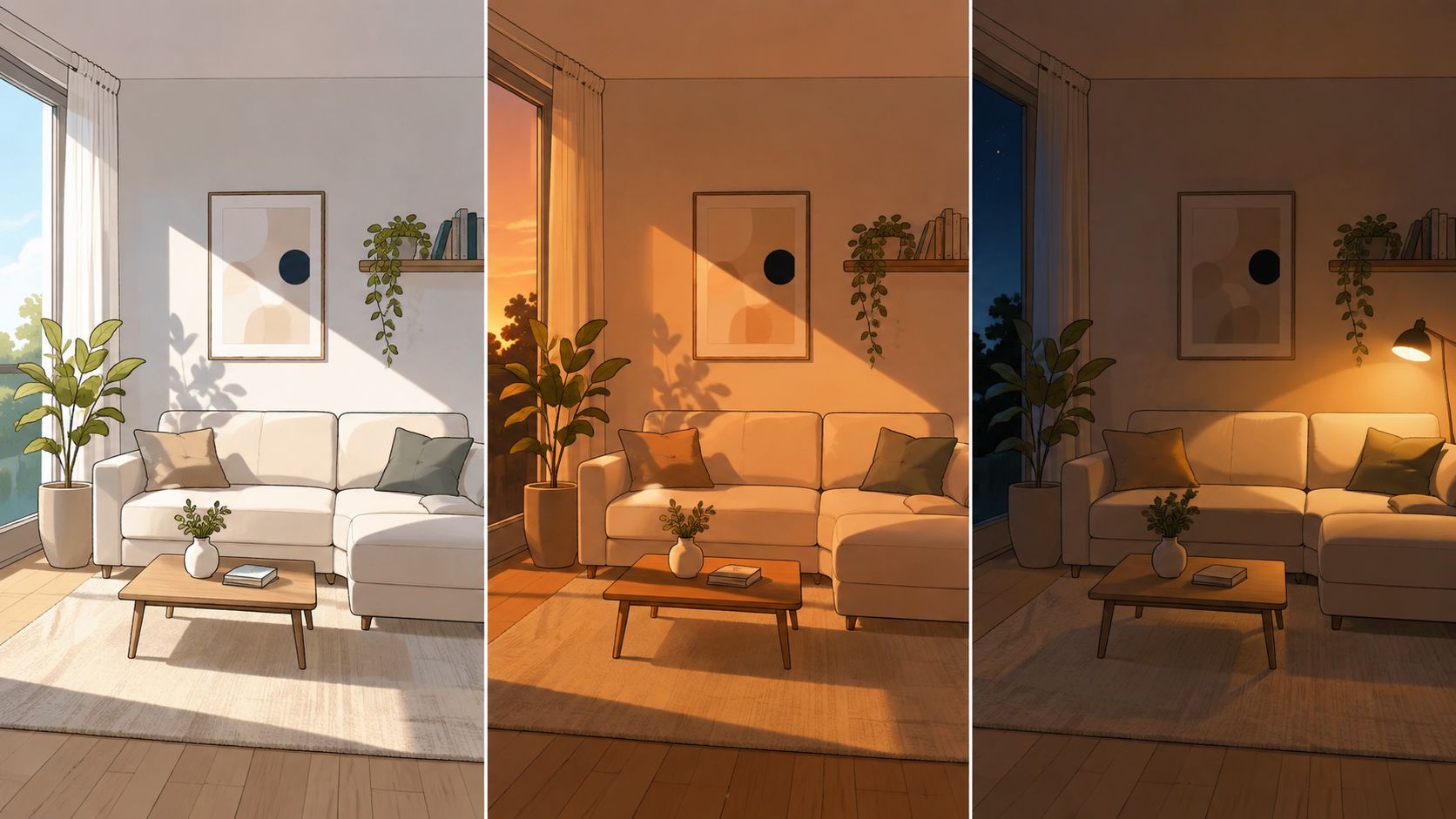
Lighting is the variable that makes neutral design tricky in real homes. The same cream sofa can look elegant in a showroom, then feel pink, beige, or dull once it's under a different bulb and placed beside Florida daylight.
Daylight and bulb temperature change the reading
Design guidance on neutral interiors notes that warm bulbs around 2700K to 3000K tend to reinforce beige, cream, and taupe undertones, while cooler 4000K to 5000K light reveals blue, green, or cooler gray undertones more strongly (Neutral interior paint colors guide). That means the room itself is part of the color decision.
In bright Central Florida homes, the effect can be dramatic. Sunlight from large windows can make a soft gray look cleaner during the day, then turn it harsher at night if the lamp light is too cool. Warm lighting often flatters wood grain and leather, while cool light can make some neutrals feel more clinical.
The room should be tested, not guessed
A neutral that works in the showroom may not work at home because the showroom light is controlled and the home light is not. That's why one reliable method is to sample paint and fabric on multiple walls and review them over a full day.
The most practical sequence is straightforward:
- Place the sample near the floor and at eye level. Colors read differently near flooring than they do on open wall space.
- Look at it in morning light. Early light often reveals the coolest shift.
- Check it again late afternoon. Strong sun can flatten delicate undertones.
- Inspect it under evening lamps. This is when beige can go muddy or gray can turn severe.
A north-facing room usually benefits from warmer neutrals, while a bright south-facing room can tolerate cooler grays or greiges more comfortably (Mint Terrace neutral color palette guide). That directional logic matters in Florida homes with big windows and hard sunlight, because the wrong undertone will keep changing on the homeowner.
Layering Textures to Prevent Flat, Boring Rooms
Neutral rooms fail when every surface feels too similar. A beige sofa, beige walls, and beige rug can look unfinished if nothing interrupts the sameness.
Use three different material families
A reliable way to avoid a flat room is to repeat at least three finishes or textures across the space. That might mean upholstery, wood, and metal, or leather, wool, and glass. The point is to give the eye something to move across.
Here's a simple showroom-ready formula:
- Soft surface: linen, performance fabric, or leather for the sofa and chairs.
- Hard surface: a solid wood coffee table, sideboard, or dining table.
- Reflective surface: brass hardware, a glass lamp, or a glazed ceramic accessory.
A smooth leather sofa beside a nubby throw works because each surface reacts to light differently. A matte wood table beside polished metal also keeps the room from sinking into one note.
A neutral room should feel layered, not loud. Texture does the work that color would normally do.
Wood tone matters just as much as fabric
Oak, walnut, and maple all bring different character to neutrals. Oak tends to feel grounded and familiar, walnut reads richer and deeper, and maple can feel cleaner and lighter.
Mixing warm and cool wood tones can work, but the balance has to be deliberate. If the room already has warm flooring, a cooler gray wall and a pale upholstered chair can keep the space from feeling too heavy. If the room has cooler surfaces, a warmer walnut table or aged brass detail can restore comfort.
For a serene bedroom backdrop, a useful visual resource is this bedroom retreat inspired by neutrals, especially if the goal is to coordinate bedding texture with a restrained wall palette.
Room-by-Room Neutral Design Applications
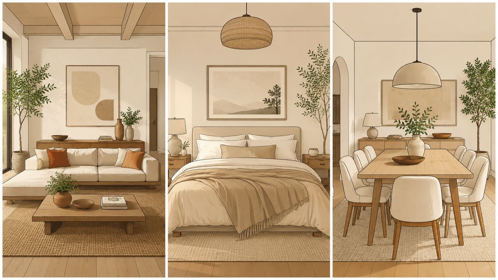
Neutral design becomes much easier when it's tied to the way each room is used. A living room needs visual warmth and comfort, a bedroom needs softness and rest, and a dining room needs enough structure to support gatherings without feeling stiff.
Living room
A living room in Central Florida often works best with a warm neutral base, especially if the space gets strong afternoon light. A taupe or greige sofa, a solid wood cocktail table, and a lighter rug can keep the room feeling grounded without closing it in.
A recliner with clean lines and warm leather can anchor the space beautifully, especially when paired with accent pillows in linen, wool, or textured performance fabric. Slone Brothers Furniture also offers complimentary in-home design services that can help match sofa scale, finish, and room light to the actual space.
Bedroom
Bedrooms usually benefit from the softest treatment of neutrals. Cool whites and pale grays can calm the room, but they need warmth from wood furniture, drapery texture, or upholstered details so the space doesn't feel stark.
A solid wood bed frame and matching dresser do more than fill the room. They give the neutral palette structure, which matters when daylight changes from morning to night. A bedroom in Sanford or Altamonte Springs with bright windows may need a warmer white than a shaded room in a denser neighborhood.
Dining room
Dining rooms are often the best place to use deeper neutral woods. A warm wood table, neutral upholstered chairs, and layered lighting can make the room feel polished without demanding bold color.
Collections from Canadel, Stickley, and MAVIN fit that approach well because the material story matters as much as the silhouette. In a dining room, a good neutral palette supports the grain of the table and the finish of the chairs instead of competing with them.
For casual scent layering that stays understated, a well-chosen room fragrance can help the dining area feel finished without changing the visual palette, and this guide on fragrance oils for everyday spaces can be a useful companion when planning mood.
The Long-Term Value of Neutral, Heirloom-Quality Furniture
Neutral furniture makes more sense when the piece is built to last. A sofa or dining table in a restrained palette can move through style changes far more easily than a trend-driven piece with a loud finish or a short design cycle.
Why neutral investment pieces age better
The numbers behind consumer preference support that logic. In one UK survey of 1,000 adults ages 18 to 64, 29.9% preferred a neutral interior with pops of color, while only 13.2% preferred a bold, bright, striking interior, and 34% of women preferred a timeless mid-century modern interior (survey on design trends). Another living-room survey found 68% of people preferred a neutral color scheme for the main social space, while broader home-furnishings reporting cited 78% of consumers favoring neutral tones for versatile, calming spaces and 65% of homeowners preferring neutral tones for large furniture pieces.
Those patterns make sense in the showroom. Large seating, case goods, and primary bedroom pieces are expensive to replace, so neutral selections create flexibility for rugs, art, lamps, and seasonal décor without forcing a full redesign.
Construction matters more than trend
A neutral sofa still has to be built well. Solid wood frames, high-density foam or down-wrapped cushions, and top-grain leather matter because the piece is supposed to hold up while the room around it evolves.
That's why heritage and craftsmanship matter in brands like Stickley, Smith Brothers, and Simply Amish. A neutral finish on a well-made frame looks calm now and still looks calm years later, which is exactly what a homeowner in Longwood or Winter Park wants from an investment piece.
Your Next Steps for Creating a Timeless Neutral Interior
The cleanest neutral rooms rarely come from guesswork. They come from seeing finishes in person, comparing them under the actual light in the home, and choosing furniture that belongs to the room instead of forcing the room to fit the furniture.
Start by collecting three things, a wall color direction, a furniture finish, and a texture reference. Then test those choices beside flooring, drapery, and any existing woodwork before ordering the piece.
A good next move is to visit a showroom in person, touch the materials, and sit on the furniture. That's where scale, comfort, and color accuracy become real. For Central Florida homeowners who want help connecting the palette to the actual home, Slone Brothers Furniture in Longwood offers a face-to-face consultation approach, along with custom-order options and room planning support that can be matched to the room's light and layout.
Ready to invest in neutral furniture that holds up beautifully over time? Visit Slone Brothers Furniture in Longwood, FL, and work with experienced design consultants who can help you choose the right undertones, finishes, and materials for your Central Florida home. If the goal is a calm, timeless room that still feels personal, the showroom team can help turn those decisions into a home that feels finished from day one.