
8 Colors That Go with Yellow: A Florida Design Guide


Brighten Your Orlando Home: How to Use Yellow in Your Decor
Yellow is the color of sunshine, optimism, and warmth, a natural fit for any Central Florida home. But how do you find the right colors that go with yellow without creating a space that feels too loud or dated? That's where many homeowners in Orlando, Lake Mary, and Longwood get stuck. Yellow looks easy in a photo, but in a real room with strong afternoon sun, reflective tile, and humidity-heavy air, the wrong pairing can turn cheerful into harsh fast.
Slone Brothers Furniture has served Central Florida since 1980, and yellow remains one of those colors that works best when it's handled with intention. Warm yellow carries orange undertones, while cool yellow leans green, and that difference changes which woods, metals, and upholstery finishes feel right in the room, as noted in this yellow paint design guide. A buttery wall color that looks soft in the morning may read much brighter by late afternoon in an Orlando family room.
The good news is that yellow doesn't need much to feel complete. It just needs the right partner. Homeowners who are also exploring kitchen palettes may like these Trademaster Construction kitchen schemes. Below are eight colors that go with yellow and hold up beautifully in Florida homes.
Table of Contents
- 1. Yellow & Navy Blue
- 2. Yellow & Soft Gray
- 3. Yellow & Crisp White
- 4. Yellow & Warm Terracotta
- 5. Yellow & Deep Green
- 6. Yellow & Blush Pink
- 7. Yellow & Charcoal Gray
- 8. Yellow & Soft Cream
- 8-Option Comparison: Colors That Pair with Yellow
- Bring Your Yellow Palette to Life in Longwood
1. Yellow & Navy Blue
Yellow and navy blue stay popular because they solve two problems at once. Yellow brings light and energy. Navy gives the room structure, depth, and a sense of permanence. In Central Florida homes, where daylight is strong for much of the year, that grounding effect matters.
This is one of the safest high-contrast palettes for traditional and transitional interiors. A navy sofa, navy dining chair, or navy recliner can carry the room, while yellow works better in smaller moments such as pillows, art, runners, or lampshades. That balance feels easier to live with long term.
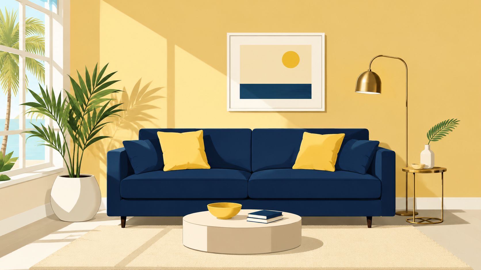
A few Longwood and Lake Mary homeowners use this palette especially well in home offices and dining rooms. A navy Stressless recliner can add ergonomic comfort without softening the room too much, while a Canadel dining set with navy upholstered chairs and a yellow centerpiece keeps the look classic rather than trendy. Stickley case goods also pair naturally with navy and yellow because the wood adds needed warmth between those stronger tones.
How to keep this pairing polished
The biggest mistake is giving yellow too much square footage. Bright yellow walls plus navy upholstery can feel theatrical under Florida sun. A softer yellow usually behaves better, especially when layered with cream, white, or warm gray.
Practical rule: Let navy handle the large furniture, and let yellow handle the conversation pieces.
Industry guidance for market and dashboard color use recommends keeping palettes to a maximum of seven colors to maintain focus, with yellow often used as a primary accent for areas that need immediate attention, according to Bookmap's color psychology discussion. That same discipline works in interiors. Yellow is stronger when it isn't everywhere.
For homeowners refining this look, Slone Brothers' guide to the perfect color palette helps connect wall color, upholstery, and wood finishes into one plan.
- Use soft yellow first: Start with a throw, bench cushion, or artwork before committing to a painted wall.
- Bring in a bridge color: Cream, warm white, or pale gray keeps navy and yellow from looking too sharp.
- Choose durable textiles: On family room accents, performance fabrics make more sense than delicate weaves.
2. Yellow & Soft Gray
Soft gray is one of the most dependable colors that go with yellow because it calms yellow without draining the room of warmth. For contemporary Orlando spaces, it often feels more current than beige and more forgiving than stark white.
This pairing works best when the gray is warm, not icy. In bright Florida light, cool gray can lean flat or bluish by midday. A warm gray with taupe or greige undertones keeps the room relaxed and makes soft yellow feel intentional rather than accidental.
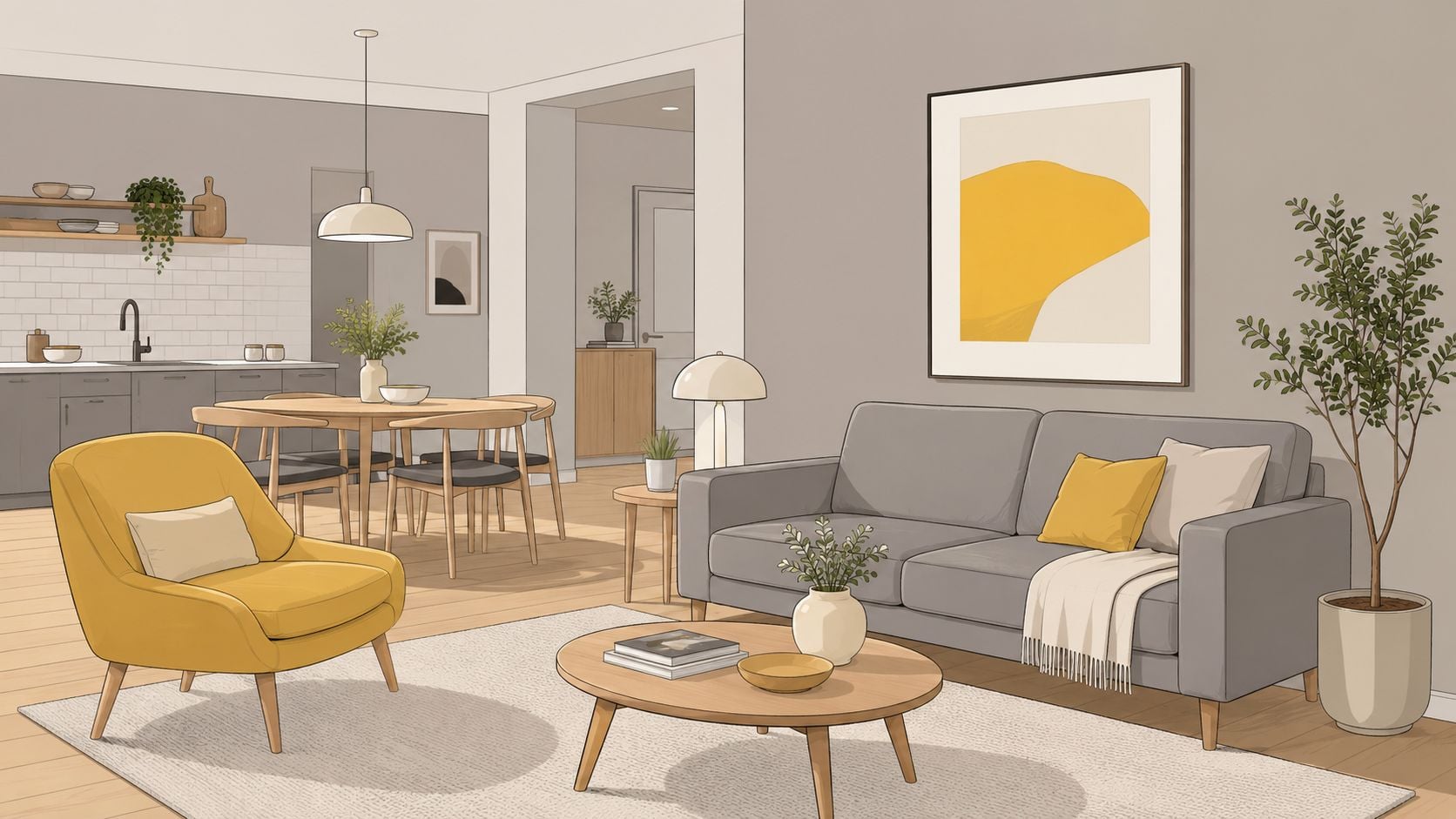
This is a smart palette for open-concept homes in Sanford and Lake Mary. An American Leather sofa in gray can anchor the seating area, then yellow can show up in a single accent chair, lumbar pillows, or framed art. In a bedroom, a gray upholstered bed with yellow bedding accents gives enough contrast to feel designed, but not overdone.
Where gray works best with yellow
Gray is strongest when it handles the envelope of the room or the major upholstery pieces. Yellow usually reads better in movable layers. That gives homeowners flexibility if tastes shift or if one room gets stronger sun exposure than another.
Pinterest's 2025 palette coverage notes growing use of butter yellow paired with greens and warm earth tones for optimistic, standout decor, and it also points to warmer gray pairings in branded visual systems through the Pinterest Palette report. In homes, the same idea applies. Gray works best when it supports yellow instead of competing with it.
Gray paint needs testing on your actual walls in the morning, midday, and late afternoon. In Central Florida, undertones shift fast.
Homeowners trying to build a cohesive living room can explore Slone Brothers' ideas for a living room color palette.
- Start with upholstery: Gray sofas, sectionals, and beds are easier to keep timeless than yellow ones.
- Add texture aggressively: Bouclé, woven rugs, and linen-look fabrics prevent gray and yellow from feeling flat.
- Use yellow in repeat points: A pillow, artwork, and one small accessory usually feel more polished than one isolated yellow piece.
3. Yellow & Crisp White
Yellow and crisp white create the kind of airy, sunlit look many Central Florida homeowners want when they move into an open, bright home. White reflects light. Yellow adds warmth and personality. Together, they make kitchens, bedrooms, and casual living spaces feel fresh.
This pairing is especially effective in homes with large windows, pale flooring, or coastal influences. White cabinetry, white bedding, or white slipcovered seating creates breathing room for yellow. The yellow can then appear in bar stools, floral patterns, a painted accent wall, or a single upholstered headboard.
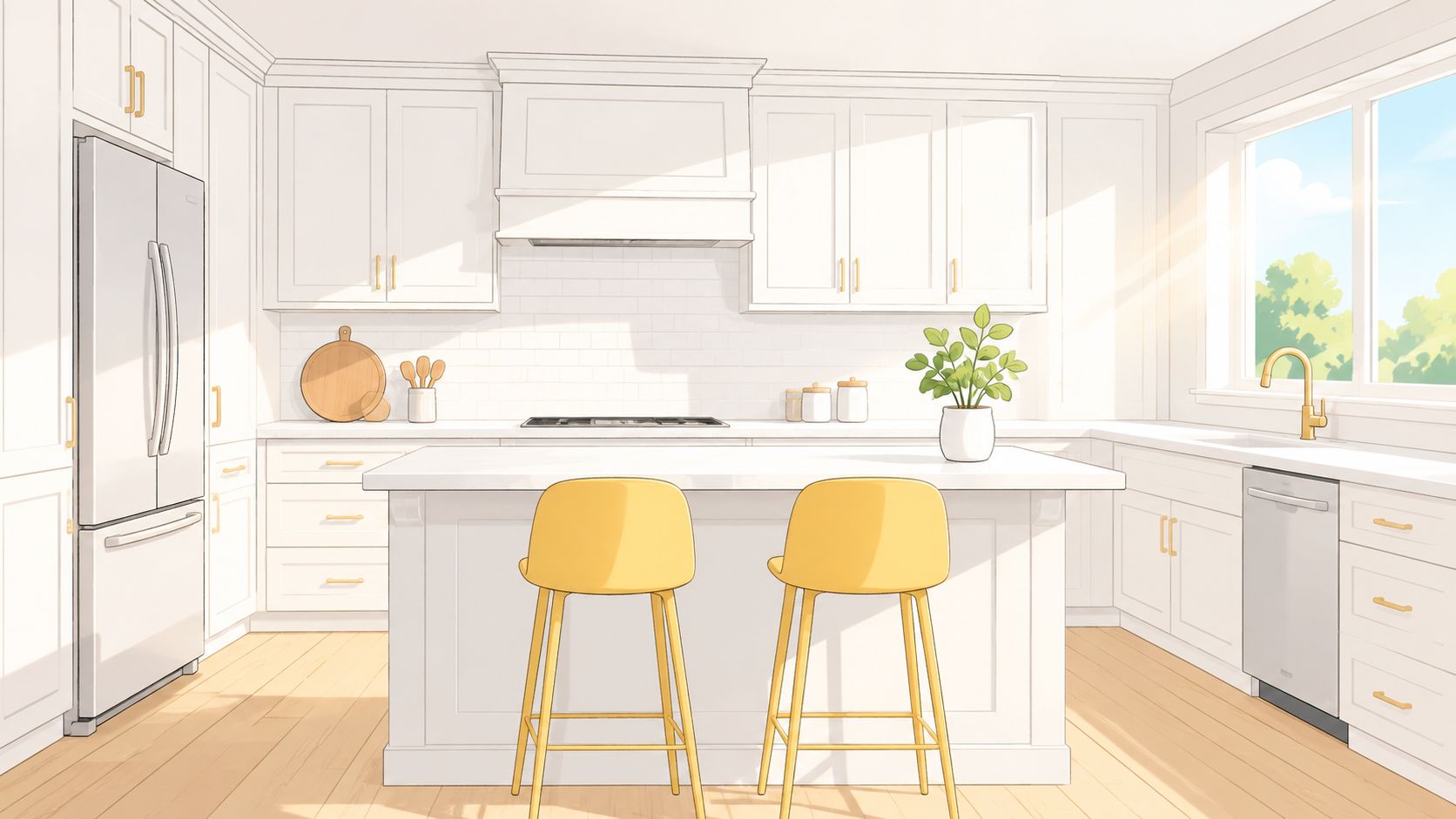
The risk is obvious. Too much white can feel sterile, and too much yellow can bounce around the room under strong sun. The answer isn't backing away from the palette. The answer is adding texture and one grounding material.
How to stop white and yellow from feeling sterile
Natural wood helps this pairing more than almost anything else. A Mavin dining table, a Simply Amish dresser, or a wood-framed bed gives the eye a place to rest and makes the room feel established. That's especially helpful in homes where glossy tile and bright walls already increase reflectivity.
For paint and upholstery planning, Slone Brothers' guide to picking the perfect paint color for your home is a useful next step.
Yellow also carries strong visual energy in data and reporting systems where it's paired with warm hues to signal high activity and caution at the same time. Bookmap identifies mustard yellow as a common warm variant and lists it as HEX #FFDE21 with RGB values of 255, 222, 33 in its discussion of visual readability and calibrated contrast for digital use. That precision matters more in dashboards than living rooms, but the design lesson still holds. Yellow needs control to stay readable.
White and yellow need a texture plan. Linen, woven shades, wood grain, and matte ceramics keep the room from looking glossy and unfinished.
- Use pale yellow on walls: Save brighter yellow for stools, pillows, or smaller decor.
- Choose washable upholstery: White seating in family spaces needs practical fabric choices.
- Control glare: Window treatments matter in Orlando homes with strong afternoon exposure.
4. Yellow & Warm Terracotta
Could a yellow room feel warmer, calmer, and more at home in Central Florida? Yellow with warm terracotta often does exactly that. The pairing has sun in it, but it also has weight, which matters in bright Longwood homes where strong natural light can make cleaner yellow combinations feel a little sharp by midafternoon.
This palette works especially well in kitchens, breakfast areas, covered lanais, and dining rooms. Terracotta brings in a baked-earth note that softens yellow and gives the room more depth. In homes with tile floors, stucco textures, or warm wood cabinetry, that connection usually feels natural instead of decorative.
A practical setup might be cream walls, a yellow performance-fabric dining seat, terracotta pottery, and a medium-tone wood table. In our Longwood showroom, this is the kind of mix that often appeals to homeowners who want color but still need the room to live easily day to day. Custom-order upholstery also helps here, since the wrong yellow can turn too orange once Central Florida sun hits it.
Best rooms for this warm palette
Terracotta does not have to be the main event. It often works better in smaller doses, through planters, tile accents, lamp bases, art, or the rust undertone in a patterned rug. That approach keeps the room grounded without making it feel heavy or overly themed.
The yellow matters just as much. Golden, straw, and ochre-leaning yellows usually sit comfortably beside terracotta. Yellows with a green cast tend to fight it. I usually recommend testing both colors in morning and afternoon light, especially in rooms with west-facing windows, because Florida sun shifts warm colors fast.
Use this palette with some restraint:
- Start with a light neutral base: Cream, sand, or soft beige keeps yellow and terracotta from crowding the room.
- Repeat the warmth in two or three places: A ceramic pot, a pillow, and one piece of art is often enough.
- Let wood do part of the work: Natural or medium wood tones help connect the yellow, clay, and any metal finishes in the room.
One caution. Too many orange-red elements in the same space can make the room feel close and busy. If the floor is warm, the wood is red-toned, and the accessories are all clay or copper, yellow loses its clarity. Off-white trim, a lighter rug, or a quieter sofa fabric usually solves that quickly.
5. Yellow & Deep Green
Want yellow to feel more settled and less sunny-breakfast-nook? Pair it with deep green. This combination gives yellow weight, which is why it works so well in studies, dining rooms, den spaces, and formal living areas.
In Central Florida homes, this pairing also solves a practical problem. Strong sun can make yellow read louder by midday. Deep green helps control that effect, especially in rooms with large windows or bright afternoon exposure around Longwood and Sanford. The palette still feels warm, but it has more structure.
How to balance richness without making the room feel closed in
Deep green absorbs light fast. In a room with heavy drapery, dark flooring, and limited lamp light, it can start to flatten the space. I usually recommend keeping one major surface light, whether that is the trim, the rug, the ceiling, or a larger upholstered piece. That contrast gives the green some breathing room and keeps yellow from looking sharp against it.
This is also a good palette for homeowners who want color without repainting every wall. A green accent chair, darker drapery panel, or cabinet finish can do a lot of the work. If you want to test the combination first, Slone Brothers shares a few smart ways to add color to your home without painting.
A setup I like in our Longwood showroom uses deep green on the larger note and yellow as the accent. That might mean a green upholstered host chair, warm wood dining table, and yellow in the art, lumbar pillows, or a patterned bench seat. In bedrooms, deep green behind the bed or on the bedding can anchor the room, while yellow stays softer through a quilt, throw, or one accent pillow.
Deep green and yellow usually need a natural connector. Wood does that job well.
- Keep the yellow muted: Butter, straw, and soft gold are easier to live with than high-chroma lemon next to a dark green.
- Use green in more than one place: A chair and drapery, or bedding and artwork, makes the palette feel deliberate.
- Watch undertones in the wood: Medium walnut, oak, and other natural finishes usually bridge these colors better than red-heavy woods.
- Choose clean shapes: Cleaner profiles keep this palette classic instead of theme-driven.
Custom-order pieces are especially helpful here because scale and fabric matter as much as color. At Slone Brothers, we often help homeowners build this palette around a sofa, accent chair, or dining set first, then adjust the yellow so it still looks right in Florida light. Simply Amish and Mavin are particularly useful here because the wood craftsmanship gives the room visual depth before color even enters the picture.
6. Yellow & Blush Pink
Yellow and blush pink can go wrong fast. Used carelessly, they read juvenile or overly sweet. Used well, they create one of the most welcoming palettes in the house.
This pairing makes sense in bedrooms, sitting rooms, nurseries, and home offices where softness is the point. In Central Florida homes, blush helps mellow yellow's intensity, especially in rooms with a lot of natural light. It also plays well with creamy whites, soft woods, and warm metallic finishes.
How to make soft colors feel grown-up
The trick is contrast. Soft colors need one sharper note or one substantial material to avoid floating away. That might be a wood dresser, a brass lamp, a structured upholstered bed, or even black picture frames.
A blush accent chair next to a soft yellow wall can look polished in a reading corner, especially when the furniture has clean lines. Smith Brothers offers custom comfort that's useful in this kind of palette because shape matters as much as color. A structured silhouette keeps the room from feeling precious.
For renters or homeowners who want to test the palette without repainting, Slone Brothers shares practical ideas on adding color to your home without painting.
On the color wheel, purple sits opposite yellow, and that complementary relationship creates a high-impact look even in softer versions, according to this color pairing video explanation. Blush pink isn't the same as purple, but that principle helps explain why rosy undertones can energize yellow instead of merely fading beside it.
- Anchor the room with substance: An upholstered bed, wood nightstands, or a solid dresser keeps the palette mature.
- Use blush in fabric first: It's easier to update than pink-painted walls.
- Add one metal finish: Gold or rose-toned accents work well, but they should be restrained.
A nursery is the easiest place for this combination, but it can also create a calm guest room in Lake Mary or an inviting dressing area in a primary suite.
7. Yellow & Charcoal Gray
Want yellow to feel grounded instead of sweet? Pair it with charcoal gray.
This combination earns its keep in Central Florida homes because it stands up to strong daylight. In a sunlit office in Heathrow or a family room in Winter Park, pale grays can wash out by midafternoon. Charcoal holds its shape, and yellow keeps the room from feeling flat or heavy.
It also suits homeowners who like cleaner lines and a more structured look. Yellow brings the energy. Charcoal supplies structure. The result feels sharp, modern, and useful in rooms that need focus.
A high-contrast pairing that still feels livable
I usually recommend this palette for home offices, media rooms, and bonus spaces where contrast helps the room function better. A charcoal wall behind a desk reduces visual glare compared with a bright white backdrop, and yellow works best when it has one clear role. Use it on a desk lamp, an accent chair, artwork, or a few well-chosen pillows.
At the Longwood showroom, this is often the direction for homeowners who want something updated but not trendy. An Amisco desk chair with a charcoal frame, a custom-order sectional in a deep gray performance fabric, or a precisely crafted accent piece from one of our American-made lines can handle daily use and Florida humidity better than lighter, fussier materials. If the room gets a lot of west-facing sun, I steer clients toward muted mustard or ocher instead of a bright lemon. Those tones stay richer throughout the day.
Charcoal also needs texture. Without it, the room can read cold fast, especially with hard flooring and recessed lighting. Wood casegoods, leather, woven baskets, or a low-pile rug soften the contrast and make the palette feel finished. Slone Brothers shares more guidance on building that kind of mood and balance in this article on color-coordinated interiors that help set the mood.
One charcoal wall, or one charcoal furniture grouping, is usually enough.
- Use warm light bulbs: They keep charcoal from turning steely at night.
- Choose yellow in larger, intentional pieces: One chair or lamp works better than scattered tiny accents.
- Add a natural finish: Medium wood, cognac leather, or woven texture keeps the room comfortable.
- Watch the undertone: Warm charcoal is easier with yellow than a blue-gray charcoal.
A practical setup might include a charcoal bookcase, a yellow lumbar pillow on a gray office chair, and a wood desk that breaks up the dark tones. In a den, a charcoal sectional with custom yellow toss pillows can look polished without asking the whole room to work too hard.
8. Yellow & Soft Cream
Soft cream is one of the easiest partners for yellow because the two colors share warmth. There's no fight for attention. The room feels layered, calm, and comfortable from the start.
For homeowners who want a whole-home palette, this is often the best place to begin. Cream walls, cream upholstery, and yellow accents can move from living room to dining room to bedroom without feeling repetitive. In Florida homes, that continuity helps spaces feel cohesive even when the light changes from room to room.
The easiest whole-home yellow palette
This palette rewards subtle variation. One flat yellow won't carry an entire room, but a mix of pale yellow, muted gold, and warmer straw tones often will. Cream gives enough support that those shifts feel intentional.
It also works well with many of the brands found at Slone Brothers. A Bassett upholstered bed in cream, a Mavin wood dresser, or a Craftmaster sofa with soft yellow pillows creates a room that feels settled. American-made and Amish-crafted pieces are especially effective in this palette because workmanship becomes part of the design, not just the background.
For anyone building mood through layered color rather than high contrast, Slone Brothers' article on color coordinated interiors and setting the mood offers useful direction.
This is also a practical answer for new homeowners furnishing several rooms at once. Custom-order programs make it easier to keep cream upholstery consistent while changing yellow accents room by room. That flexibility matters when one bedroom needs to feel quiet, but a breakfast nook can handle a little more cheer.
- Layer warm whites and creams: Avoid a single bright white that breaks the softness.
- Use yellow in several shades: Soft butter, muted gold, and gentle sunflower feel richer together.
- Let wood carry warmth: Natural and medium wood tones make cream and yellow feel complete.
This pairing won't satisfy someone who wants drama. It will satisfy the homeowner who wants a welcoming house that still feels designed years from now.
8-Option Comparison: Colors That Pair with Yellow
Central Florida light changes color faster than many homeowners expect. A pairing that looks balanced in a sample book can turn flat, harsh, or overly warm once it sits in a sunlit Longwood room for a full afternoon. This side-by-side view helps narrow the field before you start testing fabrics, paint chips, and wood finishes in person.
| Palette | Implementation complexity | Resource requirements | Expected outcomes | Ideal use cases | Key advantages |
|---|---|---|---|---|---|
| Yellow & Navy Blue | Medium, requires careful contrast balance | Moderate, quality upholstery, accent pieces, occasional paint | Energetic, elegant, high-contrast focal spaces | Formal dining rooms, living rooms, traditional or transitional offices | Timeless, versatile, photogenic. Works well with brass, medium woods, and tailored upholstery |
| Yellow & Soft Gray | Medium, requires testing undertones in Florida light | Moderate, paint samples, soft furnishings, possible custom upholstery | Refined, contemporary, calm backdrop for accents | Open-concept homes, modern living rooms, home offices | Flexible, cohesive, forgiving on wear. Easy to update with pillows, rugs, and art |
| Yellow & Crisp White | Low, but needs a maintenance plan | Minimal to moderate, paint, textiles, performance fabrics | Bright, airy, spacious rooms that reflect available light | Kitchens, bathrooms, sunny living spaces, bedrooms | Makes rooms feel open, keeps the palette clean, adapts well to changing decor |
| Yellow & Warm Terracotta | Medium, requires balance so the room does not feel heavy | Moderate, paint or tile, natural materials, textured decor | Inviting, earthy warmth with a relaxed Mediterranean feel | Dining rooms, kitchens, breakfast areas, gathering spaces | Pairs naturally with wood, clay, woven textures, and warm metal finishes |
| Yellow & Deep Green | Medium to high, dark tones need a clear lighting plan | Moderate to high, quality furniture, layered lighting, trim details | Elegant, nature-inspired, richly layered interiors | Libraries, formal living rooms, transitional homes, offices | Grounded, polished, strong with traditional furniture, botanicals, and darker woods |
| Yellow & Blush Pink | Low to medium, best with good daylight or warm ambient light | Minimal, textiles, paint, soft furnishings | Soft, welcoming, gently modern spaces | Primary bedrooms, nurseries, home offices, sitting rooms | Warm, approachable, easy to introduce through fabrics and accents |
| Yellow & Charcoal Gray | Medium to high, needs texture and warm lighting to soften the contrast | Moderate, dark paint, quality lighting, textured materials | Bold, dramatic, modern statement rooms | Home offices, media rooms, contemporary living spaces | High contrast, polished, practical for active households, strong visual definition |
| Yellow & Soft Cream | Low, simple baseline palette | Minimal to moderate, fabrics, layered textures, warm woods | Warm, harmonious, welcoming interiors | Family homes, open-concept areas, cottage or farmhouse styles | Easy to coordinate across multiple rooms, forgiving, built for long-term use |
A quick rule I use in the showroom. If the room gets strong afternoon sun, soft gray, deep green, and charcoal usually need the most testing. If the room feels shaded or enclosed, crisp white, cream, and blush often come together faster.
Furniture also affects which pairing feels right. Yellow with navy or deep green usually benefits from heavier visual anchors, such as a well-built sofa, a substantial wood dining table, or a bed with a defined headboard. Yellow with cream, white, or blush gives you more freedom to custom-order lighter fabrics and keep the room feeling open, which helps in many Central Florida homes where heat and brightness already add intensity.
Bring Your Yellow Palette to Life in Longwood
Choosing the right yellow pairing is only the first step. The significant difference comes from seeing finishes, fabrics, and wood tones together in person. That matters even more in Central Florida, where strong natural light can change how yellow behaves from morning to evening.
Some homeowners want the crisp contrast of navy and yellow. Others respond better to the easy warmth of cream, terracotta, or deep green. Neither approach is more correct. The better choice depends on the room, the amount of sun it gets, and the kind of furniture doing the heavy lifting.
That's where a local showroom still matters. A photo on a phone can't show how a gray upholstery fabric shifts next to a yellow pillow, or how a wood finish softens a bright palette. In a real space, those decisions become much easier. Slone Brothers' in-house Design Team helps homeowners in Orlando, Longwood, Lake Mary, and Sanford sort through those details with practical guidance instead of guesswork.
Quality also changes the outcome. Yellow can look playful in a room built around temporary pieces, but it looks much more refined when it's paired with strong fundamentals. A well-made sofa from Smith Brothers, a custom American Leather sectional, a handcrafted dining table from Canadel, or a beautifully finished case piece from Stickley gives the palette permanence. That's often the difference between a room that feels trendy and one that feels resolved.
Custom-order furniture makes yellow easier to use, too. Many homeowners don't want a full yellow sofa, and they don't need one. A better move may be a neutral frame with yellow stitching, accent pillows, dining upholstery, or a coordinated rug and art plan. Brands like Amisco, Bassett, and American Leather make that kind of flexibility valuable because the room can be tuned to the home instead of forced into a preset look.
Slone Brothers has served Central Florida since 1980 as a local, family-owned showroom, and that history shows up in how rooms are put together. The focus stays on long-term value, American-made and Amish-crafted quality, and practical design advice that works in real Florida homes. For homeowners furnishing a whole house, refreshing one room, or even planning a commercial space, yellow can absolutely work. It just needs the right partner, the right materials, and a plan that fits the light.
Ready to find the perfect piece for your home? Visit the Slone Brothers Furniture showroom in Longwood, FL, and let our design experts help you get started!
Want to experience the comfort of a Stressless recliner, explore custom-order options from Smith Brothers and American Leather, or see the beauty of Stickley, Canadel, Mavin, and Simply Amish in person? Visit Slone Brothers Furniture in Longwood, FL, and let the local team help bring your Central Florida home together with lasting quality, thoughtful design, and the Low Price Promise.