
Master Scale and Proportion in Design for Your Florida Home


A room can have a good sofa, a solid rug, and attractive lamps, yet still feel unsettled. That happens all the time in Central Florida homes, especially after a move to Lake Mary, Sanford, or Longwood when furniture from an old floor plan lands in a new one. The pieces aren't necessarily wrong. They just don't relate well to the room, or to each other.
That uneasy feeling usually comes down to scale and proportion in design. Once those two ideas click, decorating gets a lot less frustrating. A homeowner stops guessing and starts seeing why a dining light feels skimpy, why a bedroom looks top-heavy, or why a living room feels crowded even when it doesn't have much in it.
Since 1980, Slone Brothers has served Central Florida as a local, family-owned furniture resource, and this is one of the most common design issues people bring into the showroom. The good news is that scale and proportion aren't mysterious. They're learnable, practical, and useful in every room.
Table of Contents
- Why Your Room Just Feels Off
- The Two Pillars of a Balanced Room
- Key Principles for Getting It Right
- Room by Room Application for Florida Living
- Common Scaling Mistakes to Avoid
- Design for Your Life Not Just Your Room
Why Your Room Just Feels Off
A homeowner in Lake Mary might place a substantial sofa against one wall, add two end tables from a previous home, hang art over the seating, and still feel like the room won't settle down. The sofa may be comfortable. The art may be attractive. But the wall still looks awkward, and the walk path feels tighter than expected.
That kind of mismatch usually isn't a decorating failure. It's a sizing relationship problem.
In interior design, scale means the size of an object in relation to the space it occupies, while proportion means the relationship between the sizes of different elements within that space. A dining table needs to fit the room without restricting movement, and a pendant light needs to feel appropriately sized above that table to visually anchor it, as described in this overview of scale and proportion in interior design.
The room isn't asking for more stuff
Many people respond to an awkward room by adding. Another chair. More wall decor. A larger plant. Extra pillows. That usually makes the problem louder.
What the room often needs is editing and measurement. A sideboard may be too short for the wall. A cocktail table may be too delicate for a broad sectional. A tall headboard may be battling a low ceiling.
Practical rule: When a room feels off, measuring usually helps more than shopping.
That's why accurate dimensions matter before any design choice gets locked in. A simple measuring guide like how to measure a room for furniture can prevent the most common sizing mistakes before they happen.
Central Florida homes add their own challenges
Homes around Orlando often mix open-concept layouts, volume ceilings, sunny Florida rooms, and flexible dining areas. Those features are great to live with, but they can make sizing decisions harder. A piece that looks balanced in a compact room may feel lost under a tall ceiling. A furniture grouping that works in one corner can feel crowded once traffic flow is added.
The fix starts with understanding what the eye is reacting to. Once scale and proportion are in place, a room usually feels calmer, easier to move through, and more comfortable to use.
The Two Pillars of a Balanced Room
A simple way to separate these terms is to think about a family photo wall. One question is whether the whole grouping is too small for the wall. That's scale. The second question is whether one frame is oddly huge while the others are tiny. That's proportion.
They work together, but they aren't the same thing.
Scale answers one question
Scale asks, “Does this piece belong in this room?”
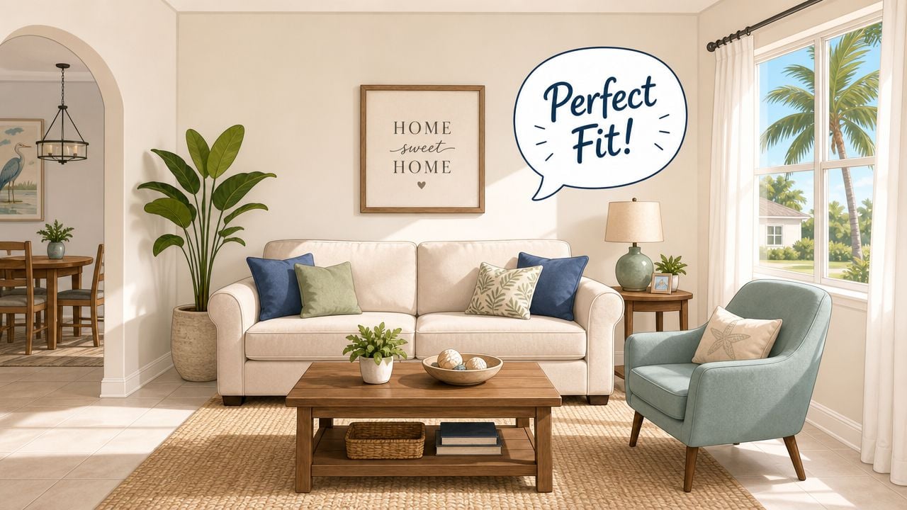
A generous sofa can look exactly right in a large Orlando living room with open circulation around it. Put that same sofa in a smaller bonus room, and the room starts to feel pinched. The sofa didn't change. The relationship did.
Scale also includes ceiling height. A low-profile piece can feel underpowered in a tall room, while a heavy, towering case piece can crowd a room with a lower ceiling.
Proportion answers another
Proportion asks, “Do these pieces belong together?”
A room can have a correctly scaled sofa for the square footage, but if it's paired with a tiny coffee table, the grouping still feels off. Proportion in design is often guided by mathematical relationships such as the golden ratio of 1:1.618, and artwork usually looks balanced when it spans 50% to 67% of the width of the furniture beneath it, according to this guide to proportion in interior design.
An oversized sofa paired with a tiny cocktail table creates visual dissonance, even when both pieces are beautiful on their own.
Scale vs. Proportion at a Glance
| Concept | What It Measures | Example |
|---|---|---|
| Scale | The size of an object compared with the room | A sectional that fits the living room without overwhelming traffic flow |
| Proportion | The size relationship between objects in the same space | A coffee table and artwork that visually match the sofa |
| Scale | The relationship between furniture and architecture | A tall bookcase that suits a room with higher ceilings |
| Proportion | The relationship within a grouping | Dining chairs, table, and light fixture that feel balanced together |
A helpful way to remember it is this:
- Scale looks outward: It compares a piece to the room.
- Proportion looks sideways: It compares one piece to another.
- Both affect comfort: If either one is off, the room feels unsettled.
That distinction matters when shopping for quality furniture. Collections from brands like Stickley, Bassett, and Craftmaster often feel more composed because the pieces within a collection are designed to relate well to one another, not just stand alone.
Key Principles for Getting It Right
Some design rules stick around because they work. They aren't there to make a room stiff or formulaic. They give the eye a structure it can relax into.
Use the golden ratio as a guide
The golden ratio has shaped visual composition for a long time, and it still gives homeowners a useful starting point. In room design, it can be applied so a primary color or object group takes 61.8% of the space, a secondary takes 30.9%, and an accent takes 8.3%, creating a balanced composition, as outlined in this explanation of proportion and scale.
That doesn't mean every room needs to feel mathematical. It means a room usually works better when one element leads, another supports, and a third adds contrast.
A living room might follow that pattern like this:
- Primary presence: The sofa and main rug carry most of the visual weight.
- Secondary support: Accent chairs, drapery, or a media console back up the main grouping.
- Accent detail: Lamps, art, or a bold pillow fabric provide the finishing note.
This is one reason coordinated collections often feel easy to live with. A Stickley dining table with a related sideboard, or a Bassett bedroom group with the right visual hierarchy, tends to arrive with built-in harmony.
Let negative space do its job
Negative space is the empty area between furnishings. It isn't wasted room. It's what keeps a space breathable. This discussion of negative space in room design makes the point clearly: even well-scaled furniture can still feel wrong when it's arranged too tightly.
In Central Florida homes, that matters a lot. Open layouts need visual pauses. Florida rooms need enough breathing room to feel airy. Bedrooms need clear space around the bed so the room doesn't feel boxed in.
A room can feel crowded long before it's full.
A few practical checks help:
- Leave visual breathing room: Don't push every wall to capacity just because there's space available.
- Watch the corners: If every corner holds furniture, the room can feel boxed in.
- Balance heavy and light pieces: A substantial sofa often needs simpler companions, not several equally weighty pieces.
For homeowners working with compact rooms, this same thinking connects closely to maximizing small space potential. The strongest small rooms don't just use smaller furniture. They use better spacing.
Another important habit is measuring the furniture itself before delivery. A guide like how to measure furniture helps homeowners compare real dimensions to the room they have, not the one they imagine.
Room by Room Application for Florida Living
Theory matters, but rooms are lived in one at a time. A family in Sanford may need a living room that handles movie night, a dining area that doesn't choke traffic flow, and a bedroom that feels restful even with a tall headboard and storage pieces.

Living rooms that feel grounded
Living rooms usually go wrong in one of two directions. They're either overfilled with seating, or they rely on undersized pieces that float without anchoring the space.
A useful benchmark is that furniture should occupy about 1/3 of the total floor area, while 66% remains as open space. In a 10×10-foot room, that means furniture should total about 33 square feet, according to this interior design scale guideline.
That benchmark helps explain why a room can feel cramped even when each individual piece seems reasonable. The total footprint is often the issue.
For a Central Florida living room, that can look like this:
- A Smith Brothers sofa: Deep enough for real comfort, but not so bulky that walkways collapse.
- A Craftmaster chair: Sized to support the sofa rather than compete with it.
- A rug and table pairing: Substantial enough to hold the whole conversation area together.
Some homeowners also need a Florida room to do double duty as lounging space and sun-filled retreat. A planning guide on how to decorate a Florida room can help align furniture groupings with that lighter, more open function.
Dining rooms that move easily
Dining rooms need more than a table that fits. They need a table and chair combination that still allows the room to function comfortably. Proportion quickly becomes evident. A thick, visually heavy table paired with very delicate chairs can feel mismatched. So can a compact light fixture over a broad dining surface.
Canadel is a strong example of a collection category where proportion matters from every angle. Table top, pedestal or legs, chair backs, and finish all have to work together visually. Amisco dining pieces raise another useful point. Metal and wood combinations can look crisp and architectural, but they still have to suit the room's scale.
For smaller dining areas, homeowners often benefit from broader decorating ideas like these tips for creating spacious rooms. The most effective ones reinforce what good proportion already does. They create calm through visual balance, not clutter through over-accessorizing.
Bedrooms that feel calm instead of crowded
Bedrooms are often where homeowners underestimate vertical scale. A headboard can change the feel of the whole room. In a room with modest ceiling height, an extremely tall bed can dominate. In a room with more height, a low bed may disappear.
Mavin and Simply Amish pieces are especially relevant here because bedroom furniture often carries strong visual weight through wood grain, panel size, and silhouette. A beautifully crafted bed still has to fit the architecture around it.
A few bedroom checks make a big difference:
- Start with the bed as the anchor: Nightstands, benches, and dressers should support its visual weight.
- Match storage to wall size: A broad dresser on a short wall usually feels forced.
- Consider daily use: If drawers, doors, and walking paths feel tight, the room is overfurnished even if it looks attractive in photos.
Bedrooms work best when every piece has enough visual and physical space around it.
Common Scaling Mistakes to Avoid
Design teams see the same issues over and over in homes across Longwood, Lake Mary, and Orlando. Most of them aren't about bad taste. They're about using a piece in the wrong relationship.

Fixtures and art that miss the mark
Lighting is one of the easiest places to spot a scale error. A common guideline is to add the room's length and width in feet to determine the ideal fixture diameter in inches. A 10×10-foot room needs a 20-inch diameter fixture, and wall art usually looks balanced when it fills 50% to 67% of the horizontal space above furniture, according to this lighting and artwork sizing rule.
That rule helps with several common mistakes:
- Too-small chandeliers: They disappear instead of anchoring the room.
- Floating artwork: Pieces hung above a sofa or bed that are too narrow feel disconnected.
- Skinny mirrors over wide case goods: The proportions fight each other.
Decor that shrinks the room
Some mistakes don't come from major furniture at all. They come from the finishing layer.
A few repeat offenders show up often:
- Tiny accessories on large surfaces: A small vase or lamp on a long console can make the surface look even larger and emptier.
- Undersized decor groupings: Decorative items generally shouldn't exceed 33.3% of the length or height of the surface they sit on, based on the planning rule covered earlier in this article's discussion of source-backed sizing guidance.
- Crowded arrangements: Even attractive pieces can feel stressful when there's no breathing room between them.
A room audit often reveals the problem quickly. If the lamp feels toy-like, the art looks stranded, or the nightstand appears dwarfed by the bed, proportion is probably the culprit.
For tighter spaces, a local homeowner may also find it useful to review how to make a small room feel big. The strongest visual tricks only work when the core scale decisions are already right.
Design for Your Life Not Just Your Room
A room can look balanced on paper and still feel wrong at the end of a long day. That usually happens when the furniture fits the square footage but does not fit the people who use it.
A simple example is a beautiful sofa that forces your knees too high, or a bed that looks polished in photos but feels awkward to climb into every night. The room is not failing because the measurements were ignored. It is failing because the body was left out of the plan.
Comfort starts with the body
Human-centered design gives scale a more useful test. Instead of asking only, “Does this piece fit the room?” ask, “Does this piece fit how we sit, rest, reach, and move?”
That shift changes real decisions around the house:
- Taller adults: They often need more seat depth, higher back support, and table clearance that does not leave their legs cramped.
- People who lounge every evening: They may care more about cushion depth, arm height, and neck support than about a sofa's overall width.
- Anyone planning a restful bedroom: Bed height, mattress thickness, and easy entry and exit affect comfort every single day.
Scale works a lot like clothing sizes. A jacket can technically go on your body and still feel stiff, short, or awkward. Furniture works the same way. A piece can fit the room and still be the wrong fit for your life.

Why custom sizing changes everything
This is why custom-order furniture matters so much. Standard sizes are built for averages. Real homes are shaped by specific people, habits, and routines.
A homeowner may need a sofa with a shorter depth so feet rest comfortably on the floor. Another may want a taller dining chair for better posture during long meals or card nights with family. A guest room may need a bed with enough presence to feel welcoming, but not so much height that it becomes inconvenient for older visitors.
Custom options solve problems a showroom floor sample cannot always solve. They let you adjust the fit, not just the look.
That is also why visual calm and physical comfort often go together. A room feels easier to live in when your body is not constantly adjusting to furniture that is slightly too deep, too low, or too high. For a related approach, see this guide to designing a room to reduce stress.
For homeowners who want help planning around real habits, Slone Brothers Furniture offers an in-house design team and custom-order options that help match room scale to everyday comfort.
The right size fits your room, your body, and the way you live.